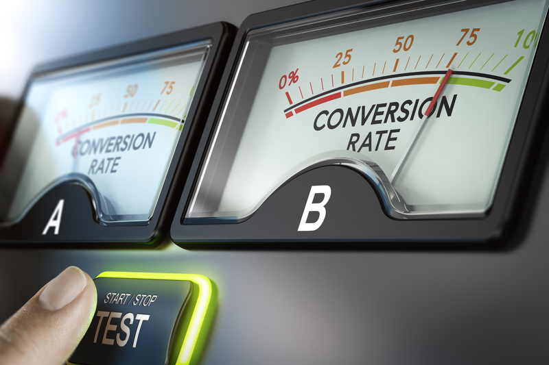
Even the smallest changes can sometimes result in the biggest increases to your conversion rate. Take the headline split test, for example. Headlines A, B and C are tested against each other. Headline A converts at 1%, Headline C converts at 2.5%, and Headline B converts at 4.9%. Hmmm, which one should you pick? The choice is obvious, you go with Headline B.

But what if you hadn’t split tested? You would never have known. Just imagine: You write a terrific headline, which happens to be Headline A. It looks like a sure winner, so you don’t bother to test. And sure enough, it converts at a respectable 1%.
BUT, if you had tested, you would have chosen Headline B. And for every 100 people who hit your site, you would have made 3.9 more sales. If your product sells for $47, that’s another $183.30 you would have earned for every 100 visitors. But you didn’t test, and so you didn’t know, and so you lost thousands of dollars. Ouch.
Testing might seem like an irritation, but there are few things that can pay off as handsomely as a simple split-test.
That’s why I’ve made a list of things you might want to test in your next sales letter or even in your next email. I’ve left out the common things like headlines, pre-headlines, sub-headlines and calls to action. You already know about those. But have you thought about testing these?
- Various bonuses tested against each other and against no bonus
- Person next door tone versus formal business tone
- Header versus no header
- Placement and look of testimonials
- Adding more images, arrows, underlining, etc.
- Adding/changing the text underneath the images
- For low priced items – Placing the price at the top (beginning) versus at the bottom (end)
- A soft sell versus a hard sell approach
- Adding more call to actions throughout
- The design of the page itself
- Wording directed to your best customer versus more generic copy
- Changing the color scheme
- Changing the color or text on the order button
- Variations on your product image(s)
- Variations on your product image size
- Variations on your product image location(s)
- Renaming your product
- Focusing on benefits versus focusing on the pain of no solution
- Placing bullets closer to the beginning versus further into the page
- Focusing on one major benefit versus a laundry list of benefits
- Having all copy or video on one page, versus using steps with a progress indicator
- A trial offer versus asking for the entire sale up front
- Sales – a percentage off versus a dollar amount off
- Coupons versus sales
- And perhaps the most interesting of all: Using dark emotions like jealousy or revenge to get the sale [“You know that snobby woman at your child’s school who thinks she’s so terrific? Right now she is praying you NEVER get this program, because if you do you’ll lose that weight and look ten times better than her. Imagine how envious she’ll be then!”] Heh heh.
Mind you, this list is to get you thinking and moving in the right direction. There’s no way you’re going to test all of these things unless you’re a compulsive profit-seeking entrepreneur who can’t rest until you’ve got the most finely tuned sales presentation in the history of the world.
For the rest of us, pick and choose what you test. If you haven’t already, start with the basics like your headlines and calls to action. Then choose something from this list and see if you can’t boost your conversion rate even higher.
To stay motivated, do the math to find out how much more you will earn on every 1,000 visitors for every tenth of a point you increase your conversions. Write this number down and post it where you’ll see it. Then every week, or every day if you’ve got the traffic, test something new. There’s no easier or faster way to give yourself raise after raise than continually split testing.
Leave a Reply